Identity · Wordmark · Publication
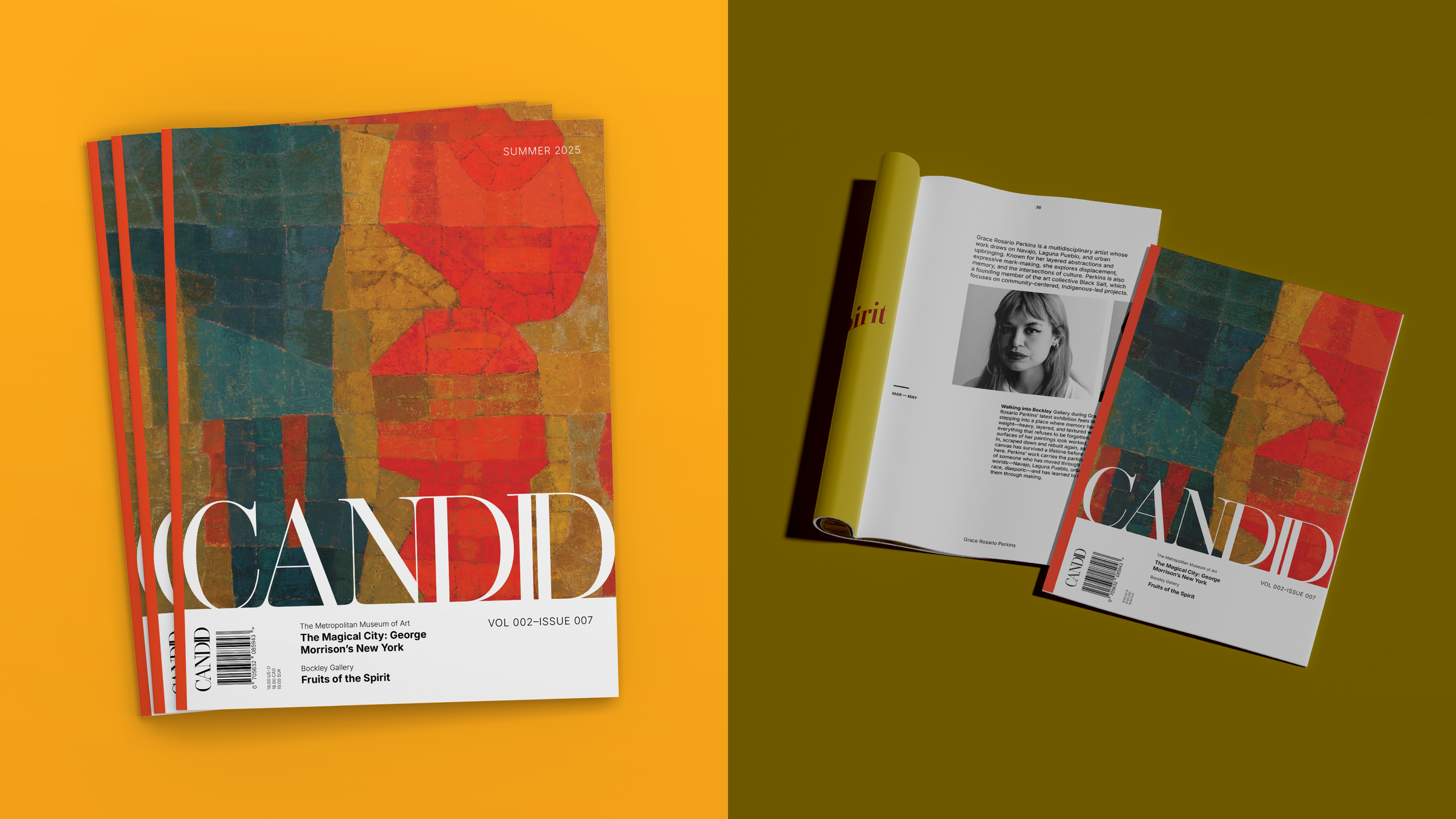
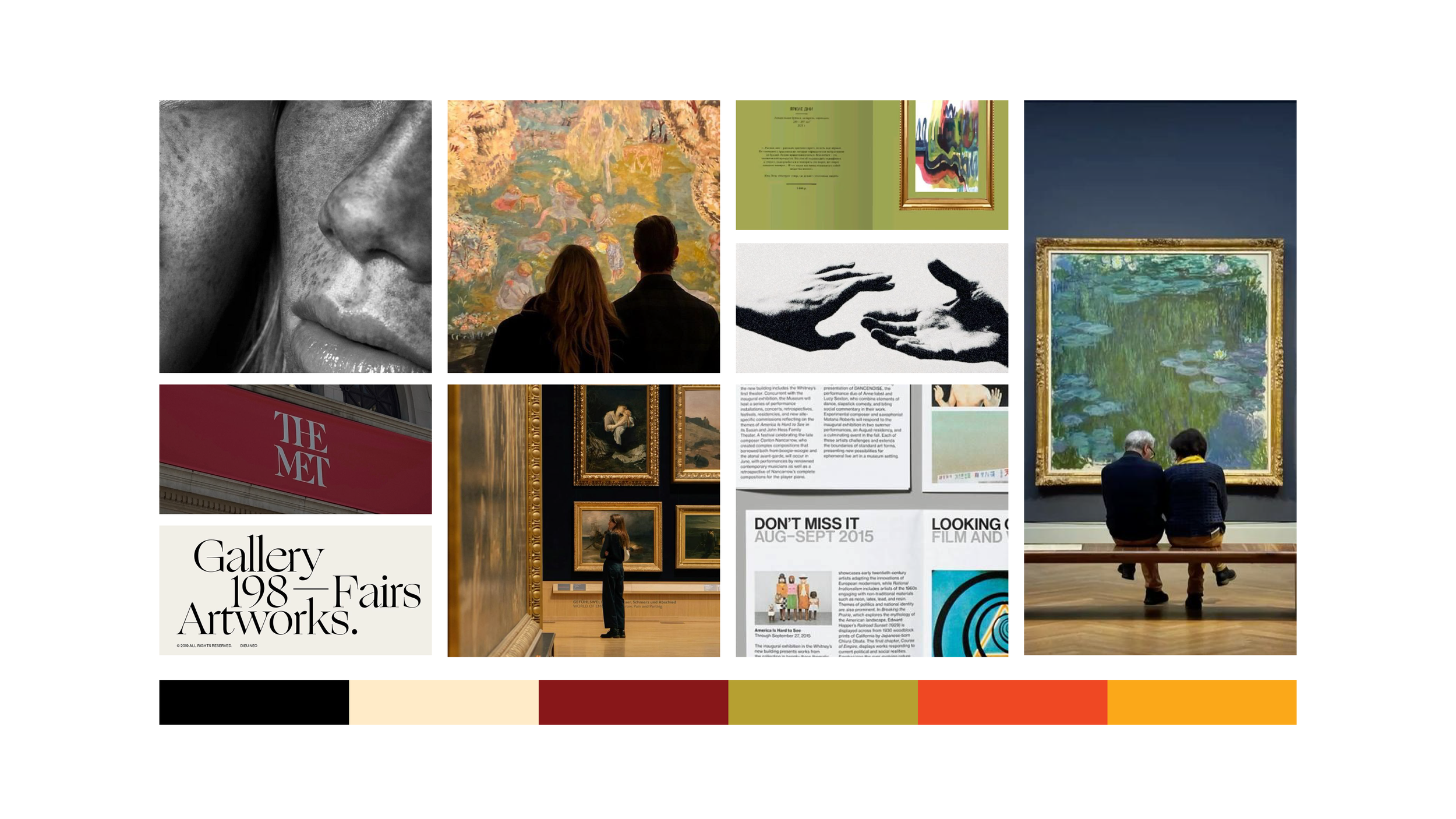
CANDID
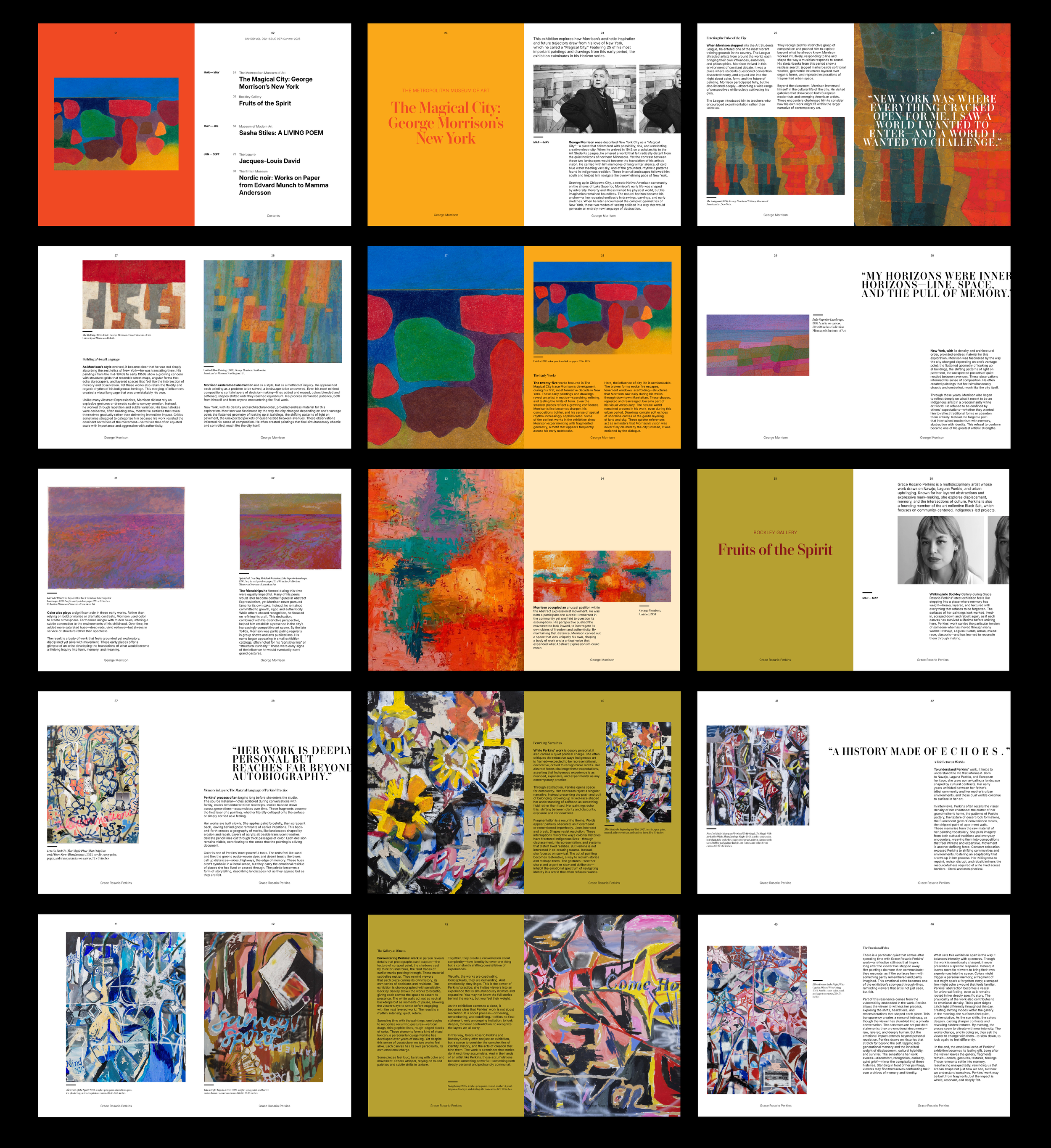
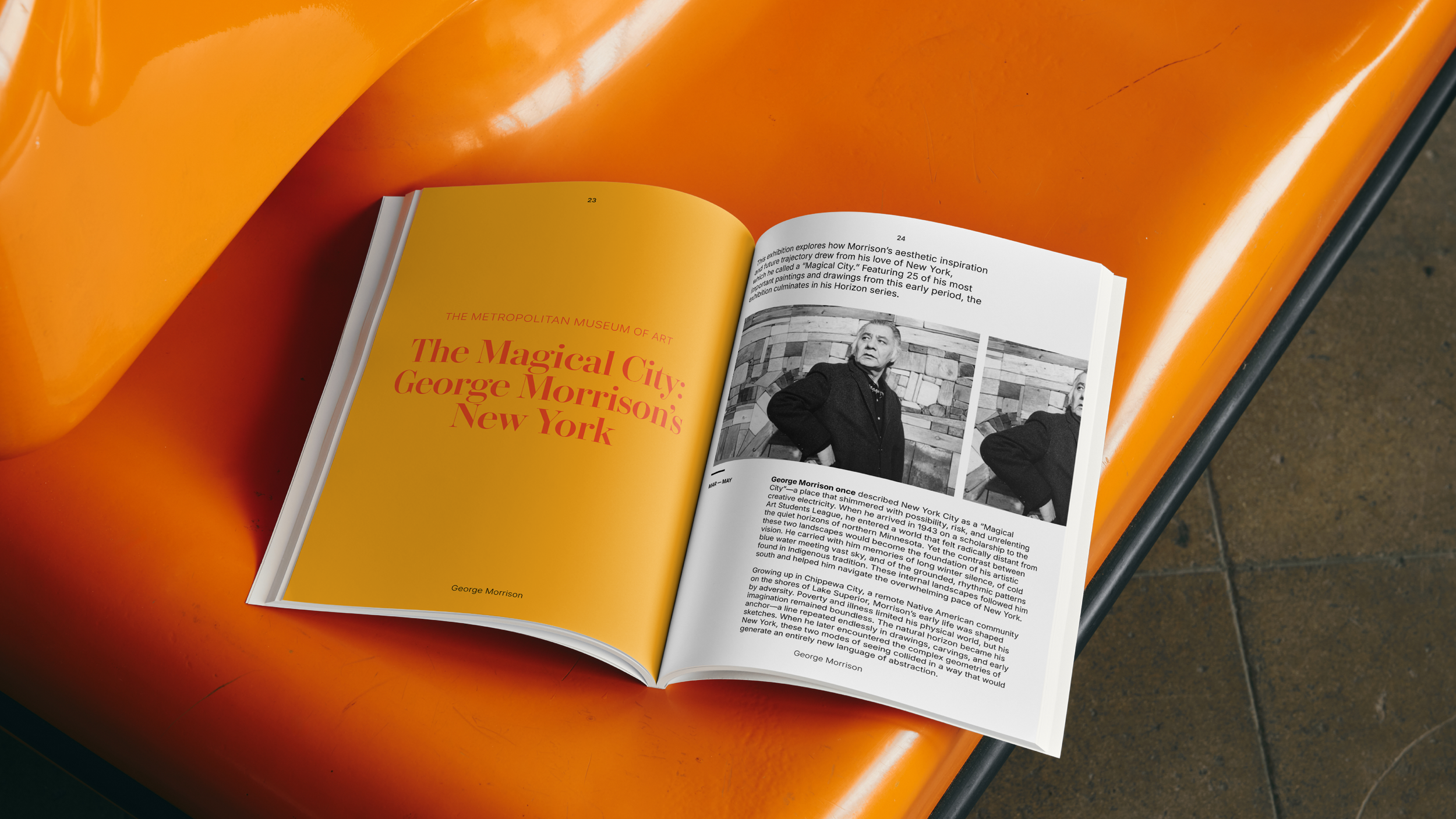
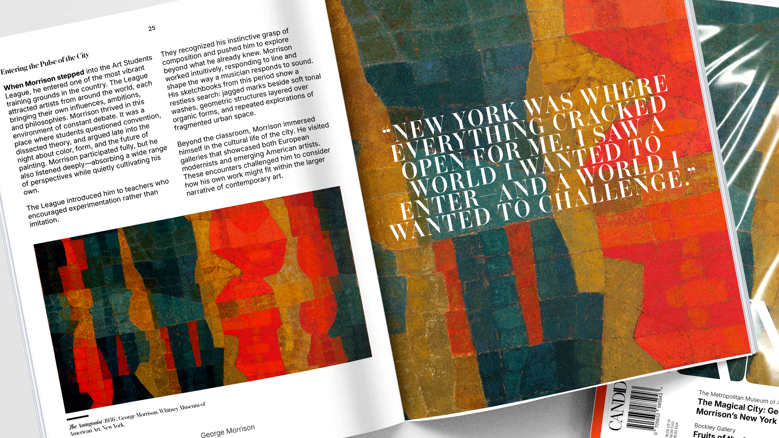
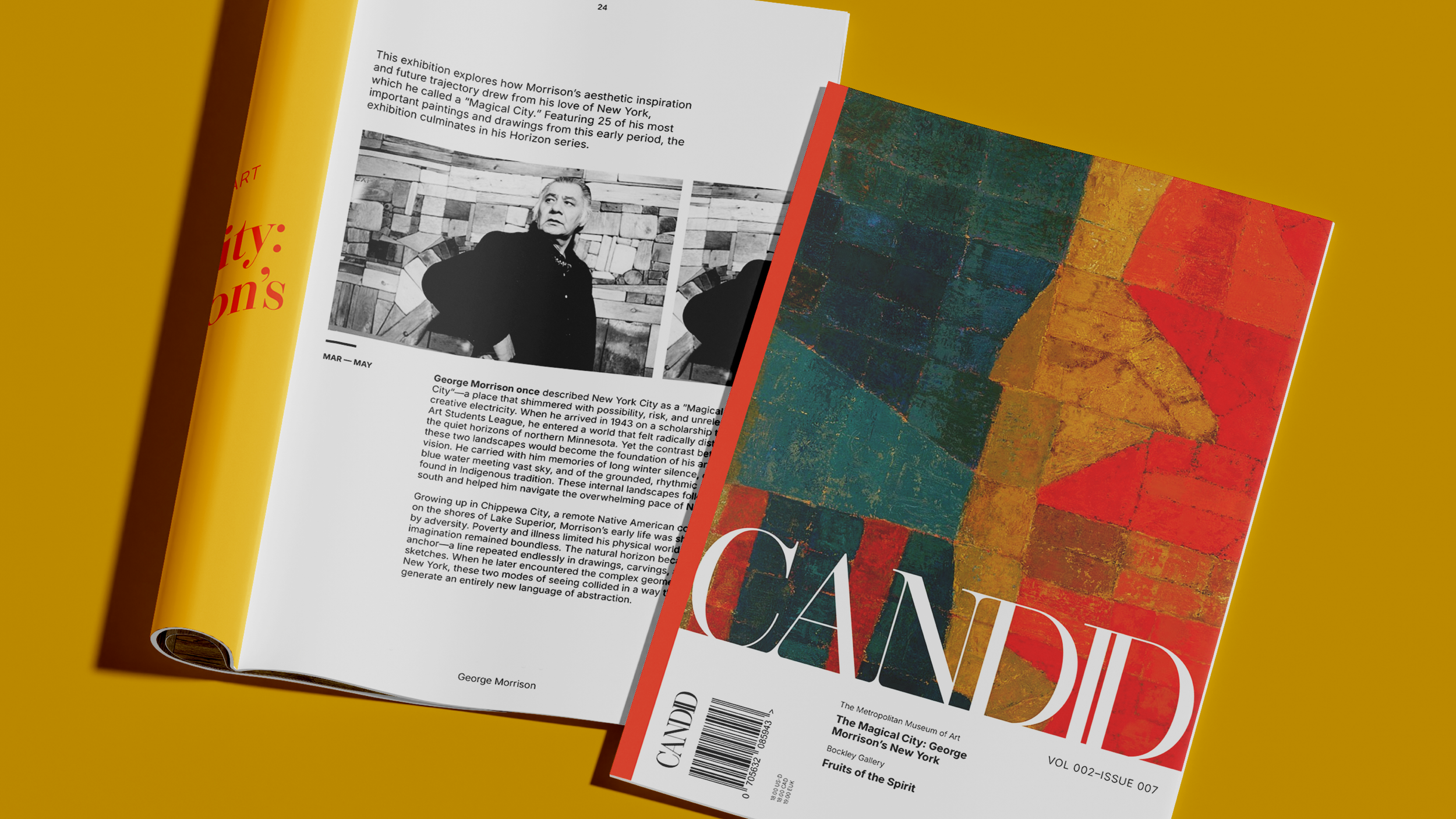
A publication that steps inside the atmosphere of the museum world, CANDID captures exhibits not as polished displays, but as living, breathing stories. Each issue peels back the walls of featured shows and invites readers into the raw, unfinished spaces where inspiration actually begins. It’s not a guide; it’s a record of the narratives that echo beyond the gallery.
*All photography is for illustrative purposes only. Photos have not been licensed and all rights belong to original creators/owners.
Designed to reflect the publication’s essence, the wordmark uses a bold, elegant serif to signal clarity, honesty, and intention. The sharp contrasts and refined letterforms mirror the way the publication approaches art: authentic, grounded in truth, and attentive to the details that often go unseen.
The Wordmark
Exploration
Concept Direction
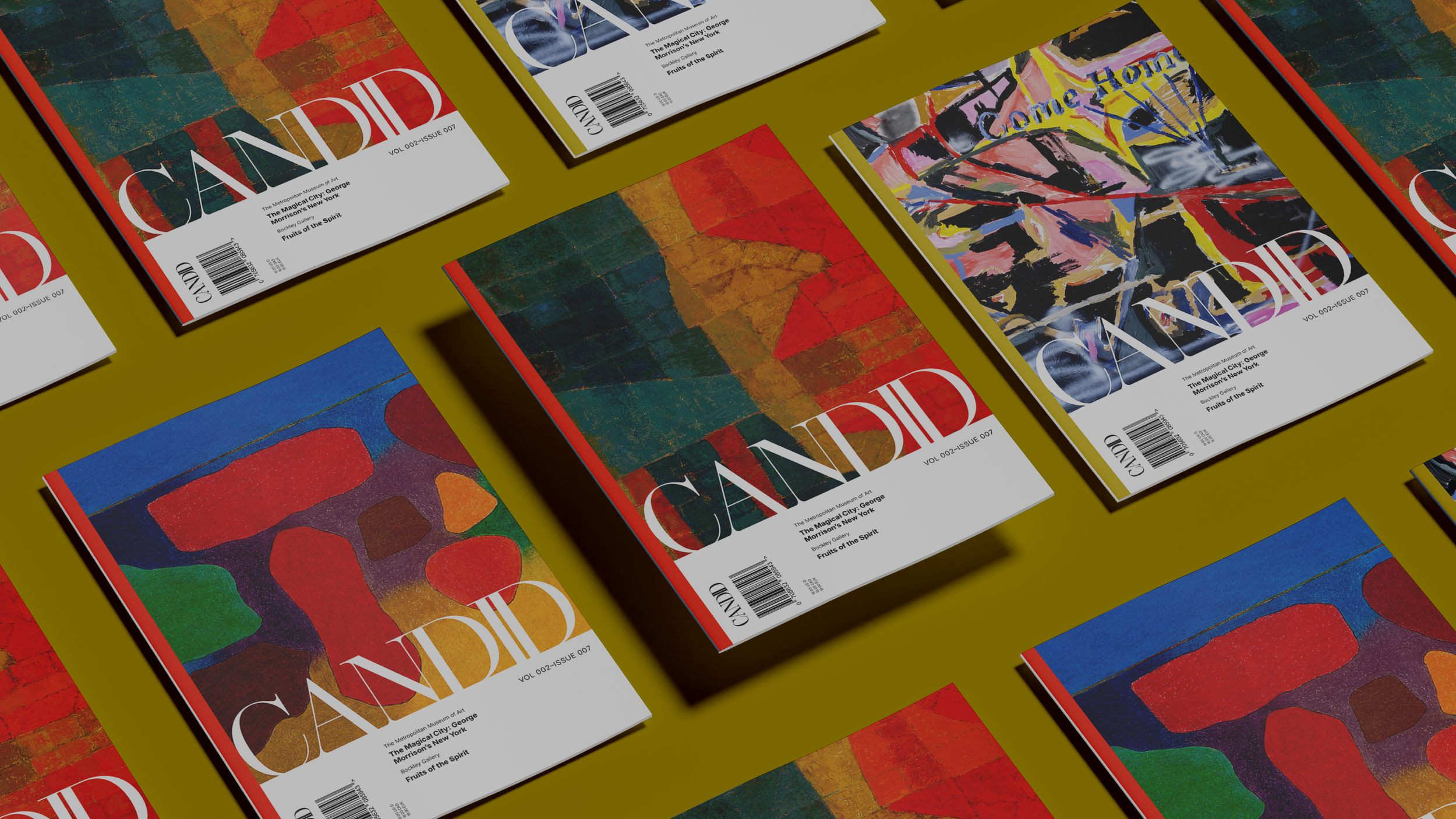
CANDID is designed with a clean, minimal layout that gives the artwork room to stand out. The design is built around clarity. Every page uses simple layouts, consistent spacing, and readable type to support the artwork. The result is a publication that feels organized, intentional, and easy to follow.
The Publication