Restaurant Identity · Wordmark
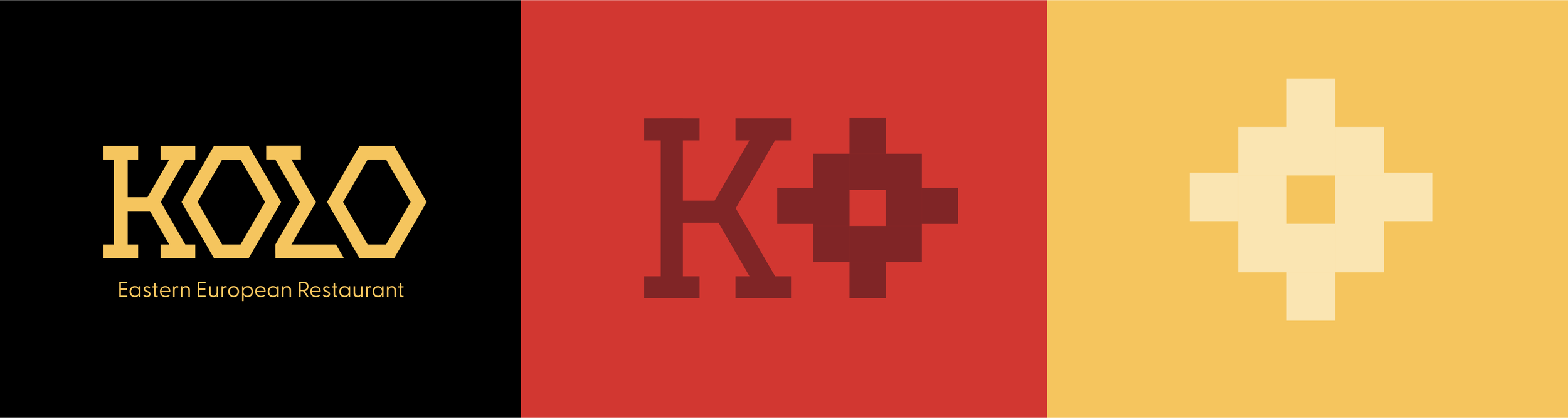
KOLO
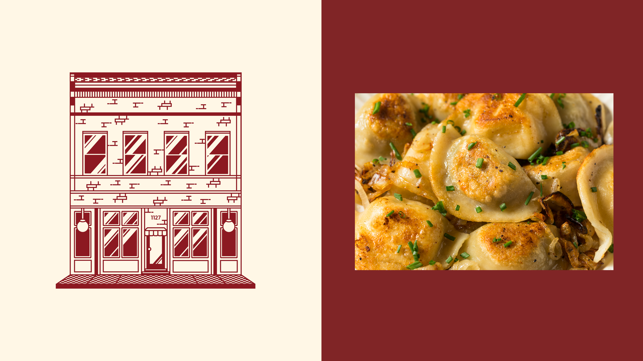
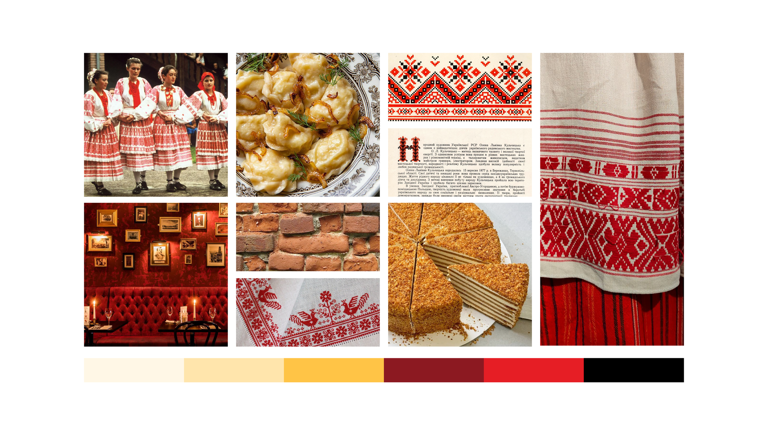
Born in New York City generations ago, it began with a Belarusian immigrant, a handful of cherished recipes, and a deep longing for home. Rooted in Belarusian heritage, it’s a circle of community, warmth, and traditional. A place where every dish carries a memory, and every meal feels like coming home.
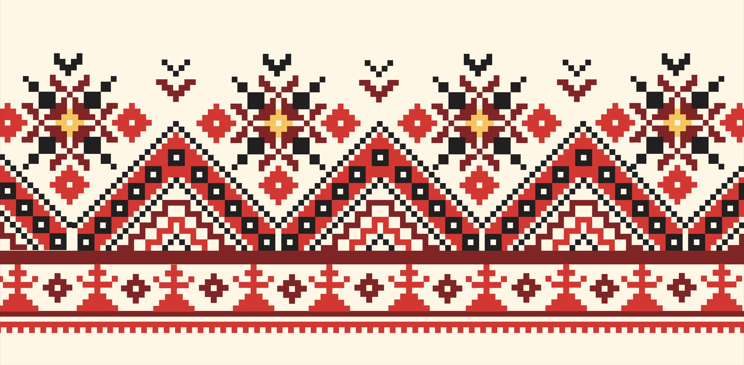
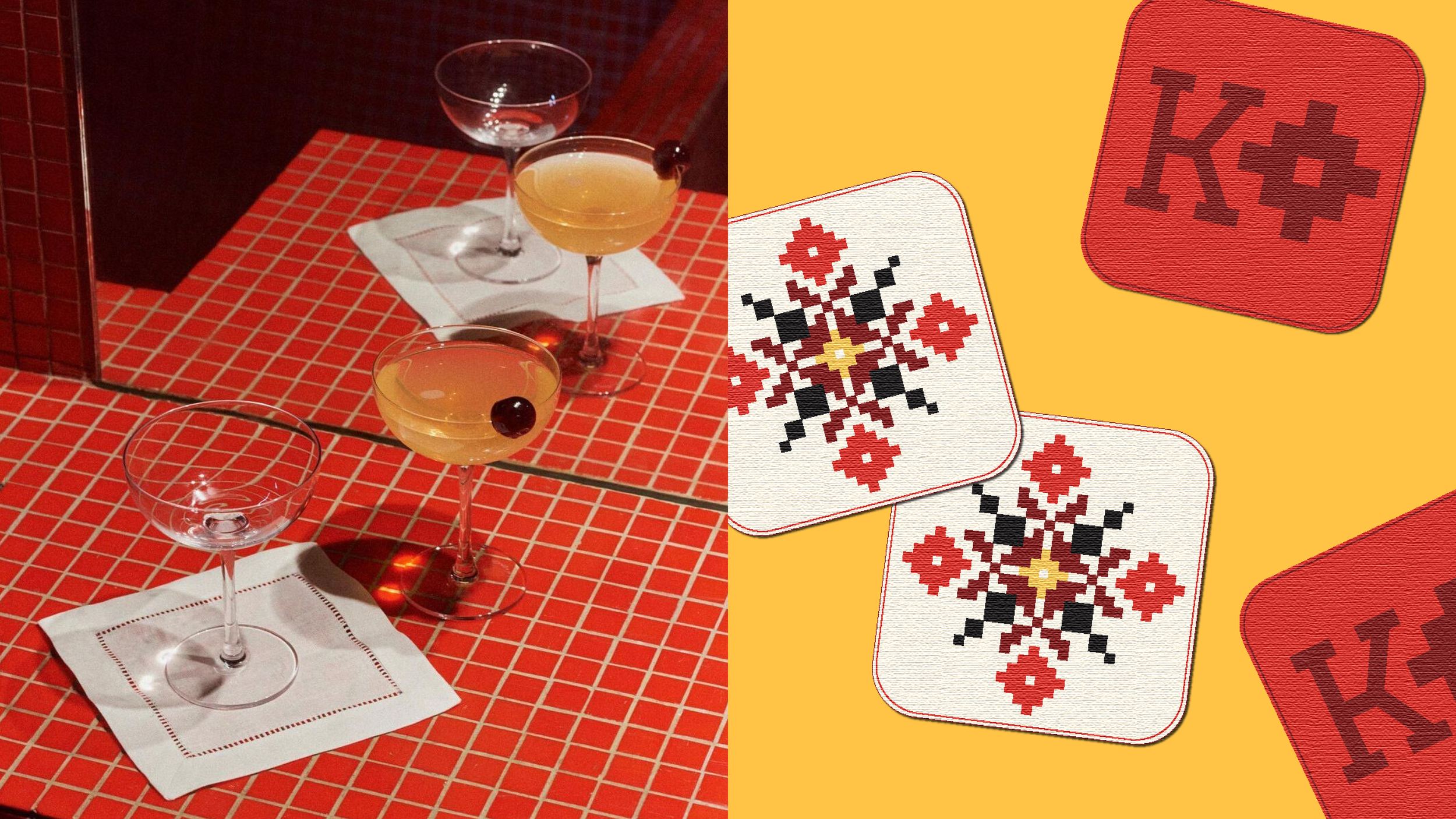
The wordmark is inspired by traditional Belarusian embroidery patterns commonly found on household textiles like tablecloths and napkins, traditional clothing and accessories. These patterns are geometric, symbolic, and stylized. These qualities helped guide my design decisions, emphasizing a strong geometric structure, symmetry, and embroidery-like details. The slab serif letter forms are sturdy and reflect the rhythm of these traditional stitched patterns, adding a sense of heritage and craftsmanship.
The Wordmark


Exploration
Concept Direction
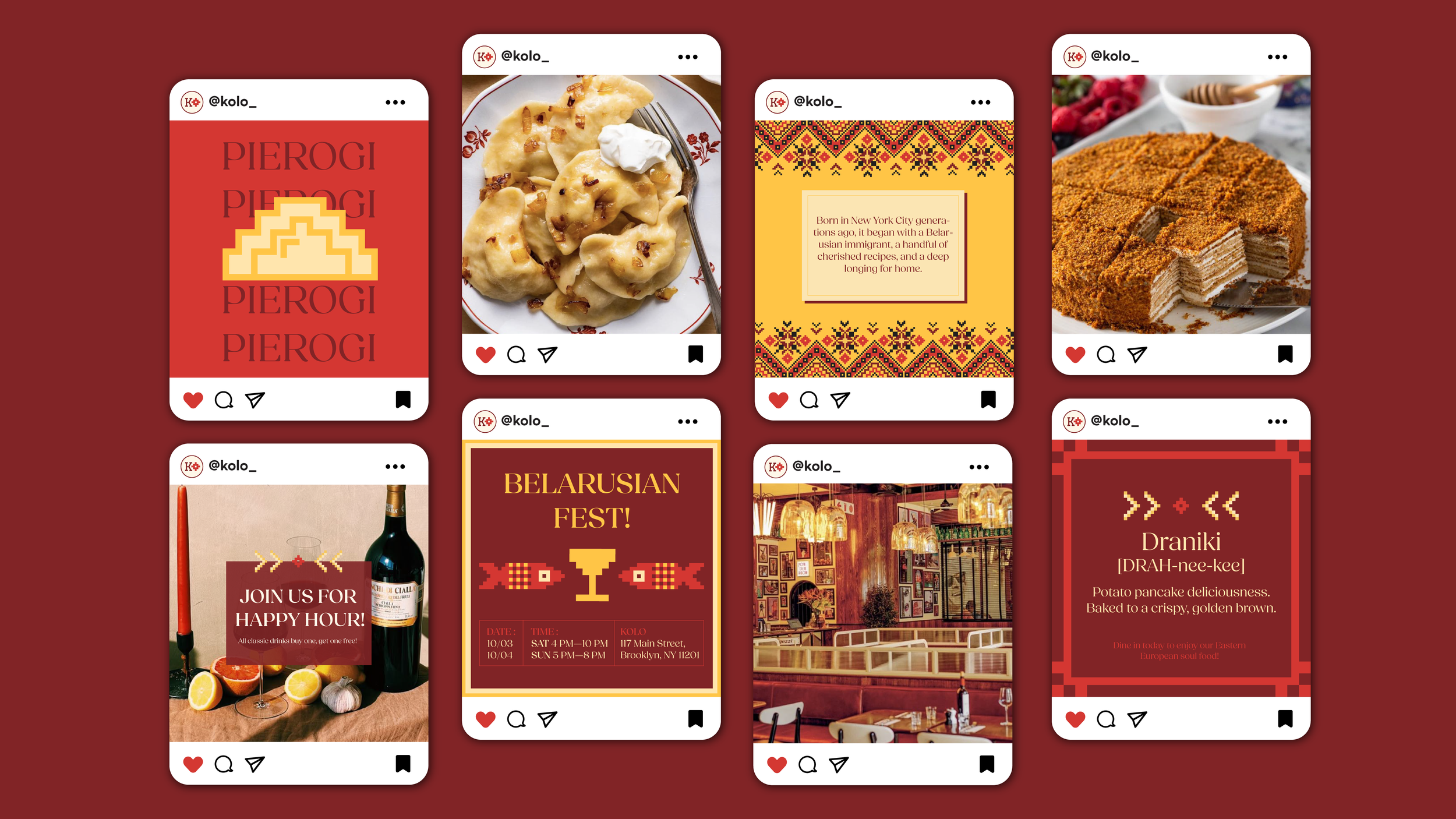
The menu is a key touchpoint in my restaurant because it communicates directly with customers about the food we serve. Inspired by traditional Belarusian embroidery, the menu includes geometric and stylized patterns that reflect the cultural roots behind the brand. These visual elements create a strong connection to the wordmark and overall identity, bringing a sense of heritage, warmth, and craftsmanship to the dining experience.
The Menu