Brand Identity · Wordmark · Packaging
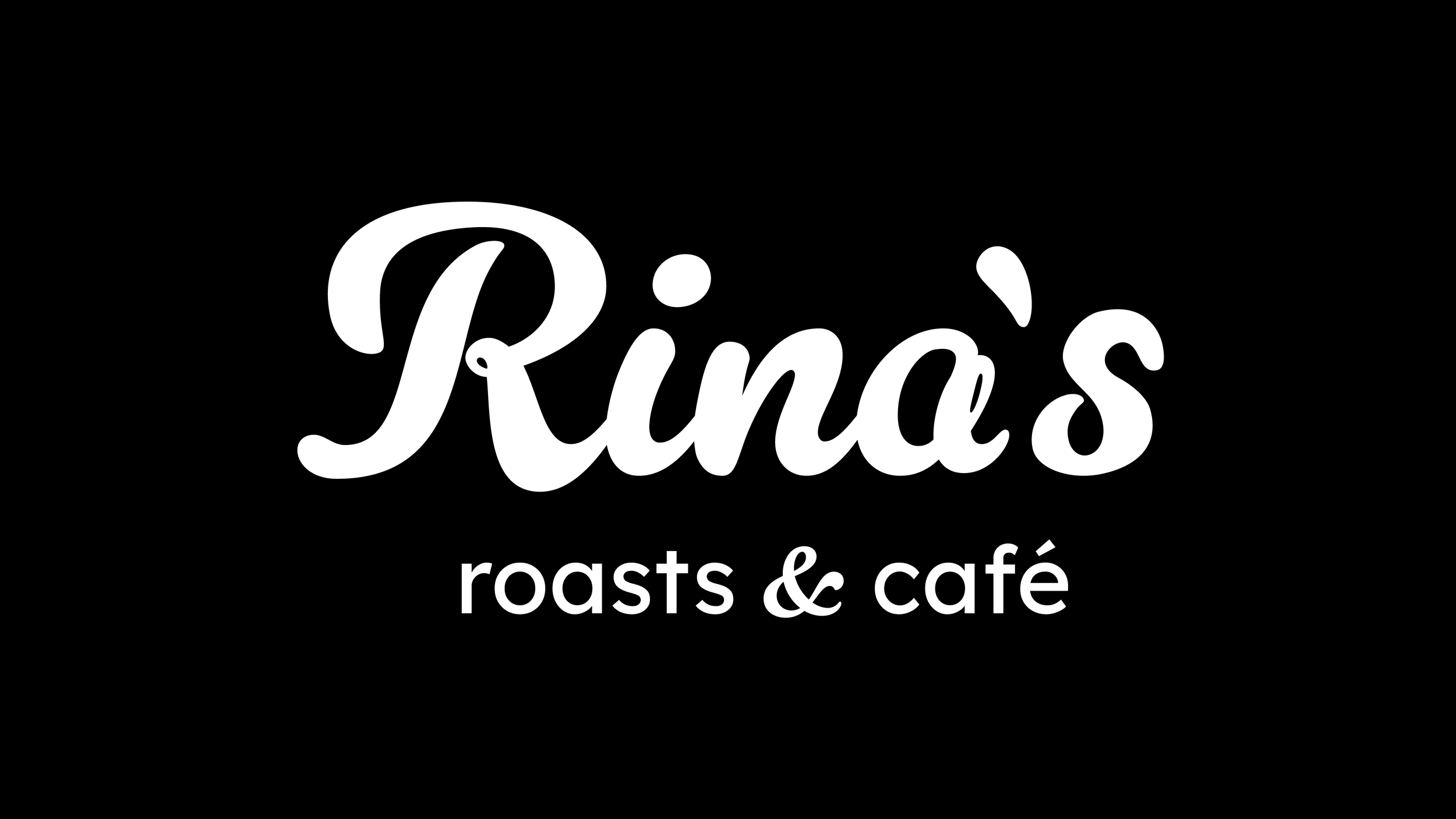
Rina’s Roasts
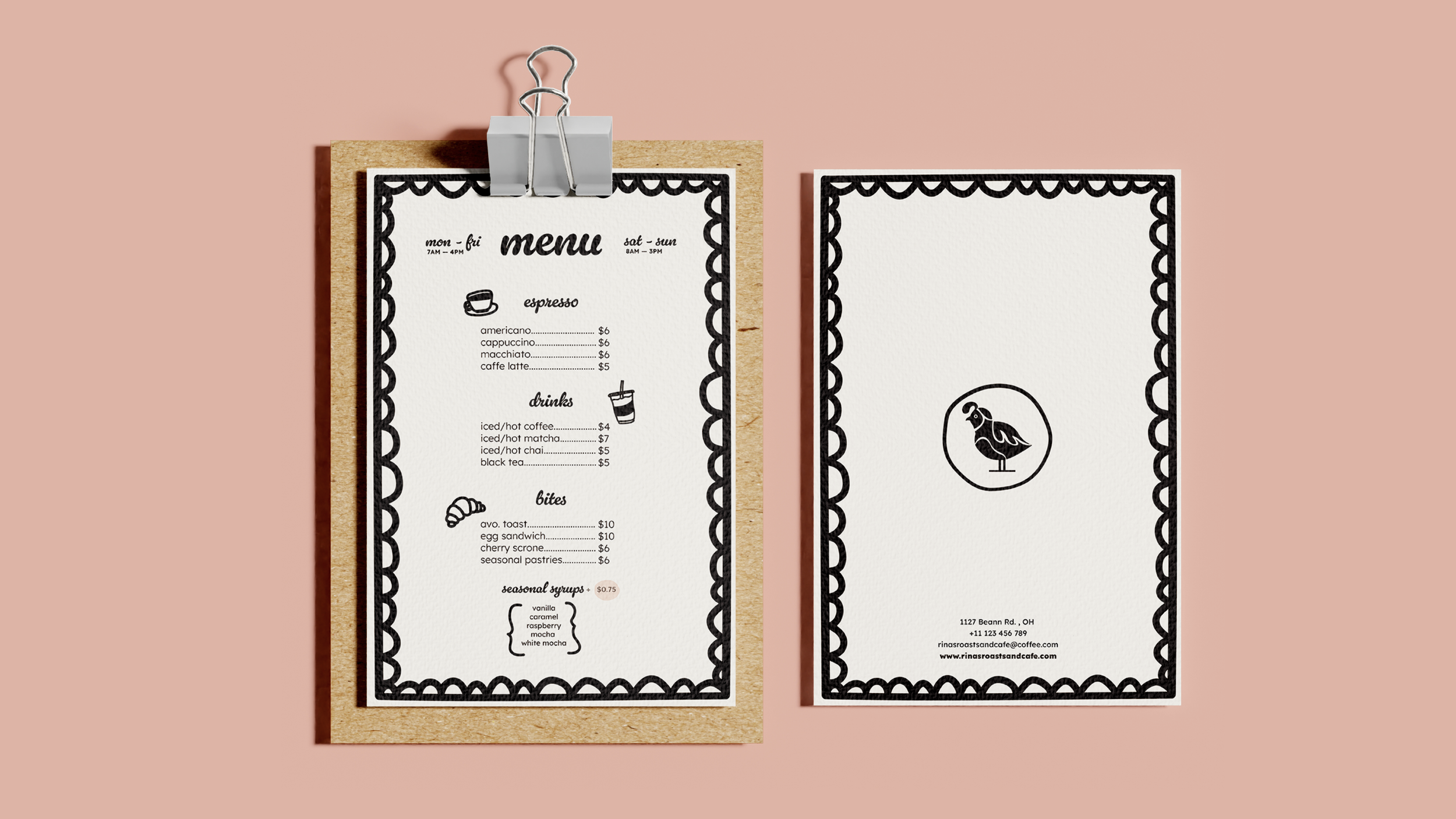
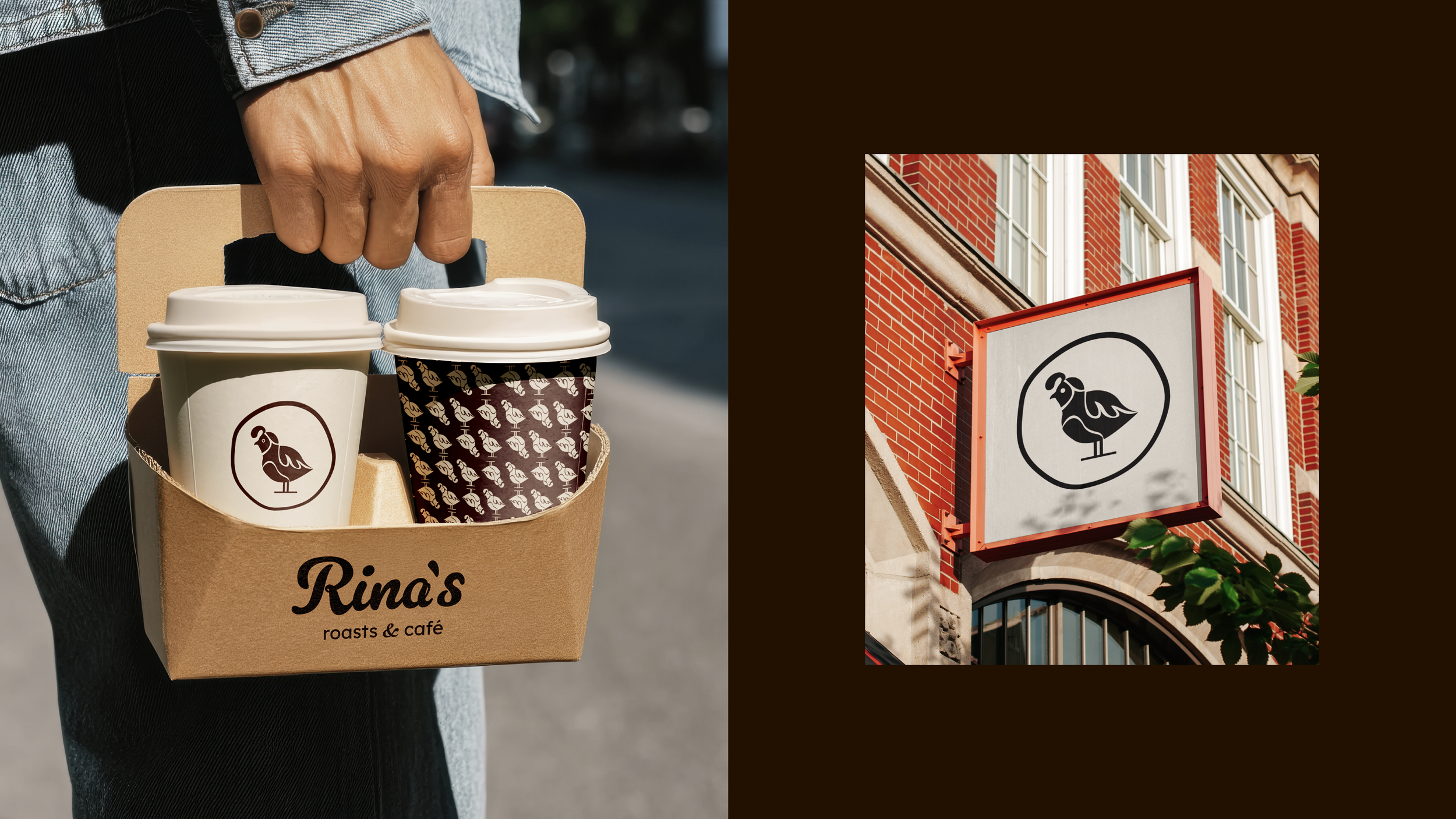
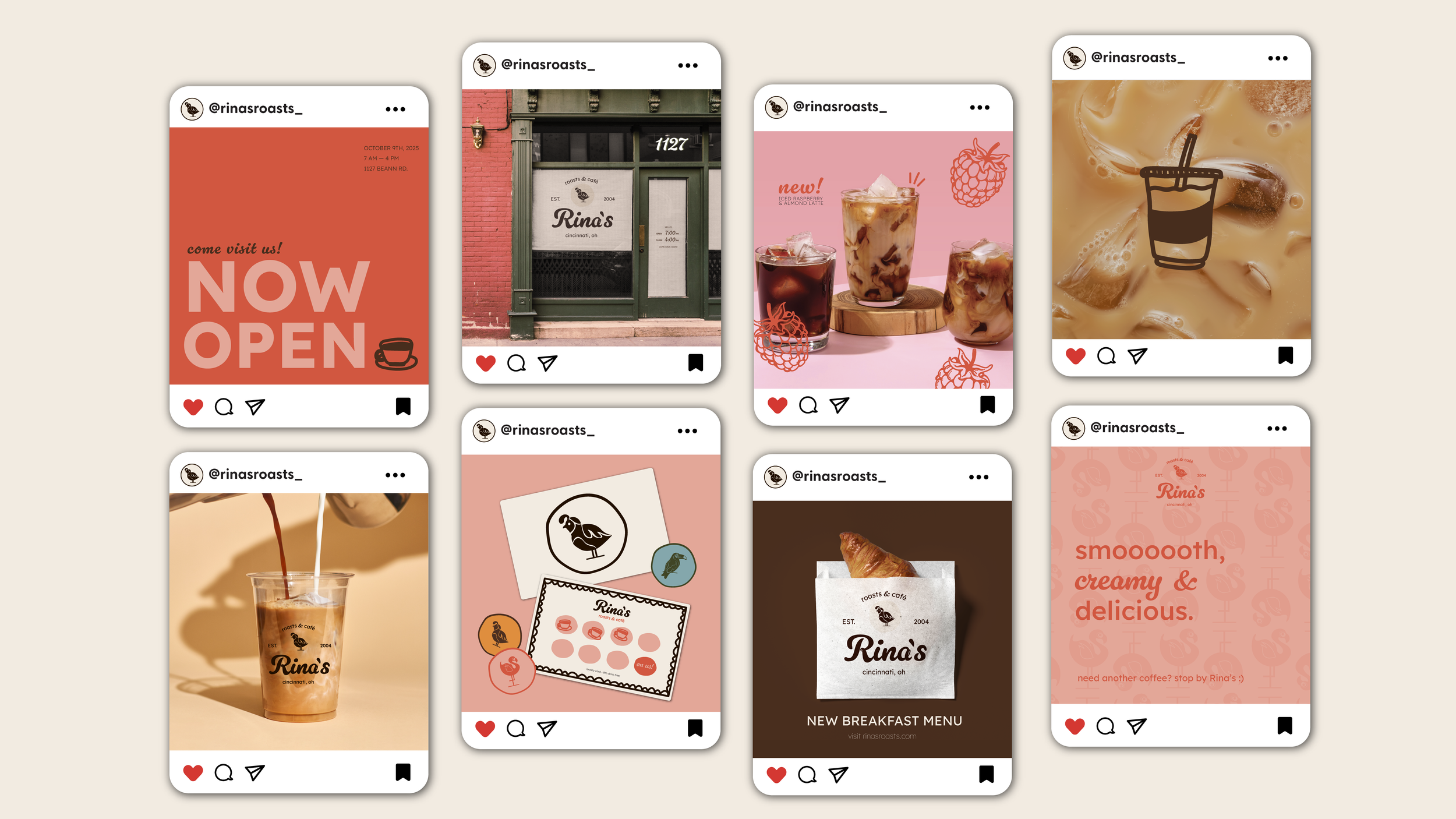
With a love for good coffee, Rina’s is centered around a flock of vibrant birds. This brand blends community, coffee, and craft with a burst of color and charm. This concept brings that world to life through packaging and a storefront that invite people to slow down, savor, and enjoy a moment that feels welcoming, expressive, and full of color.
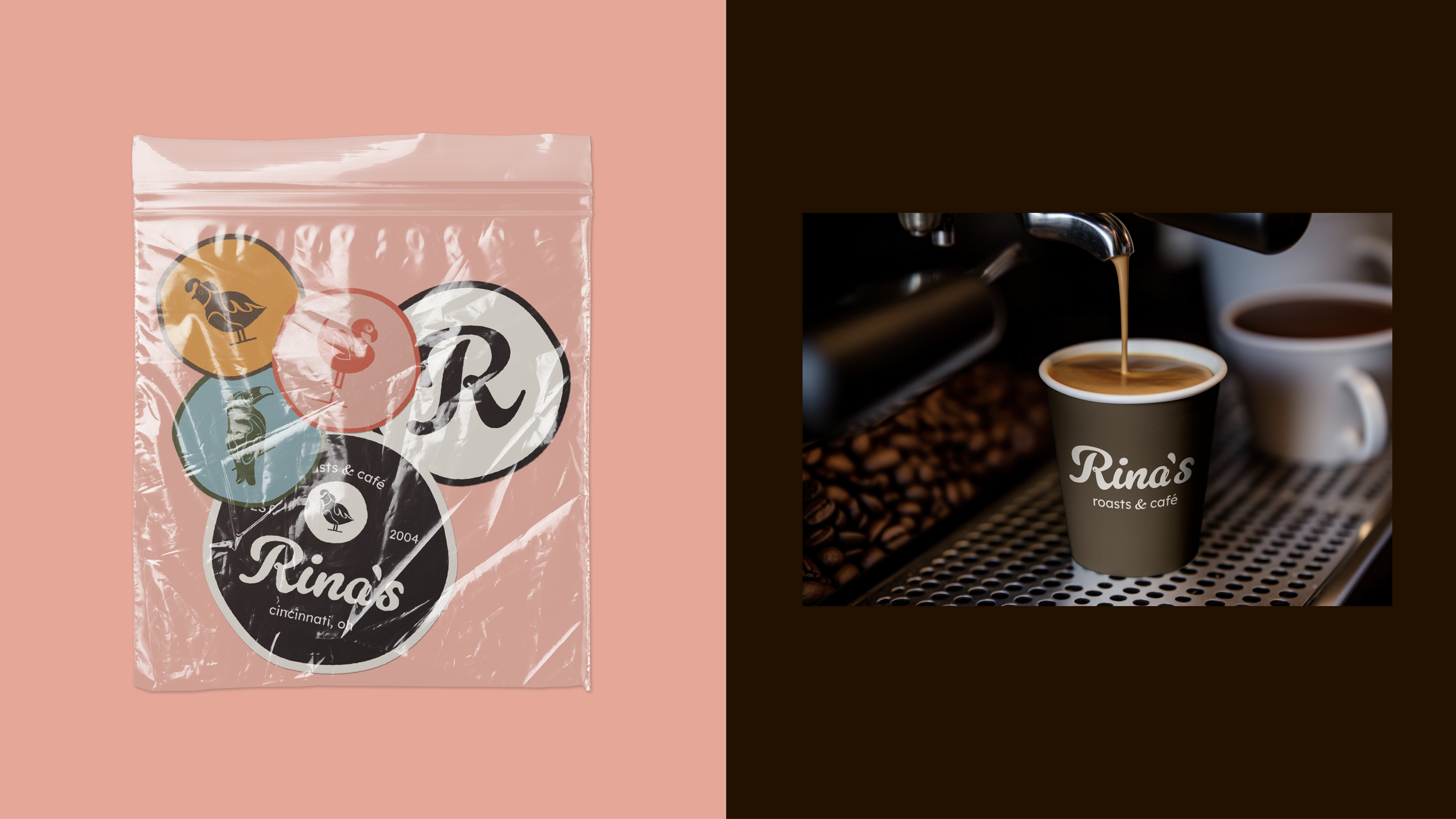
The wordmark uses expressive script lettering to capture the brand’s lighthearted personality. Its curves and looping strokes introduce a sense of motion that echoes the lively bird iconography. Rounded edges and a generous weight add warmth and approachability, while the contrasting sans-serif descriptor brings structure and clarity. Together, the forms create a mark that feels warm, contemporary, and distinctly playful.
The Wordmark
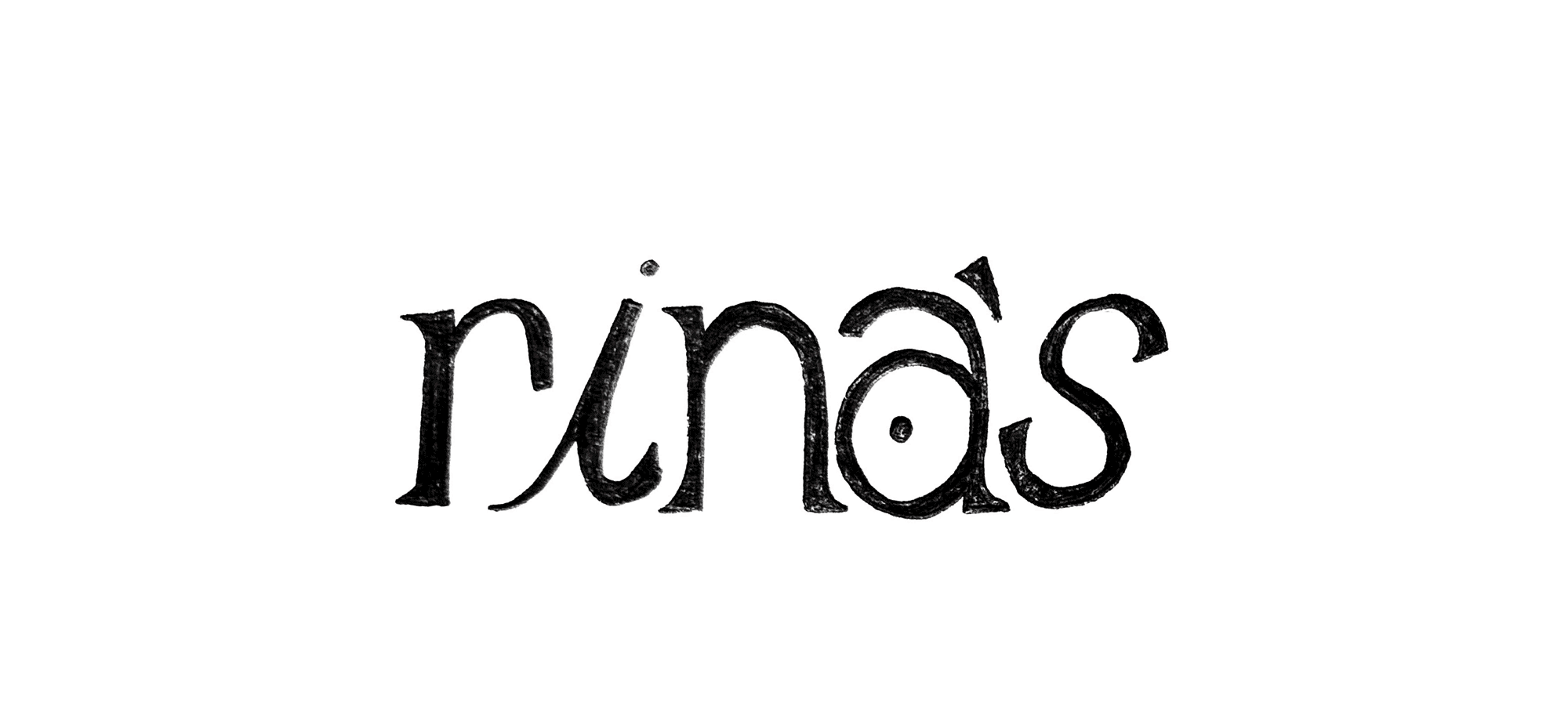
Exploration
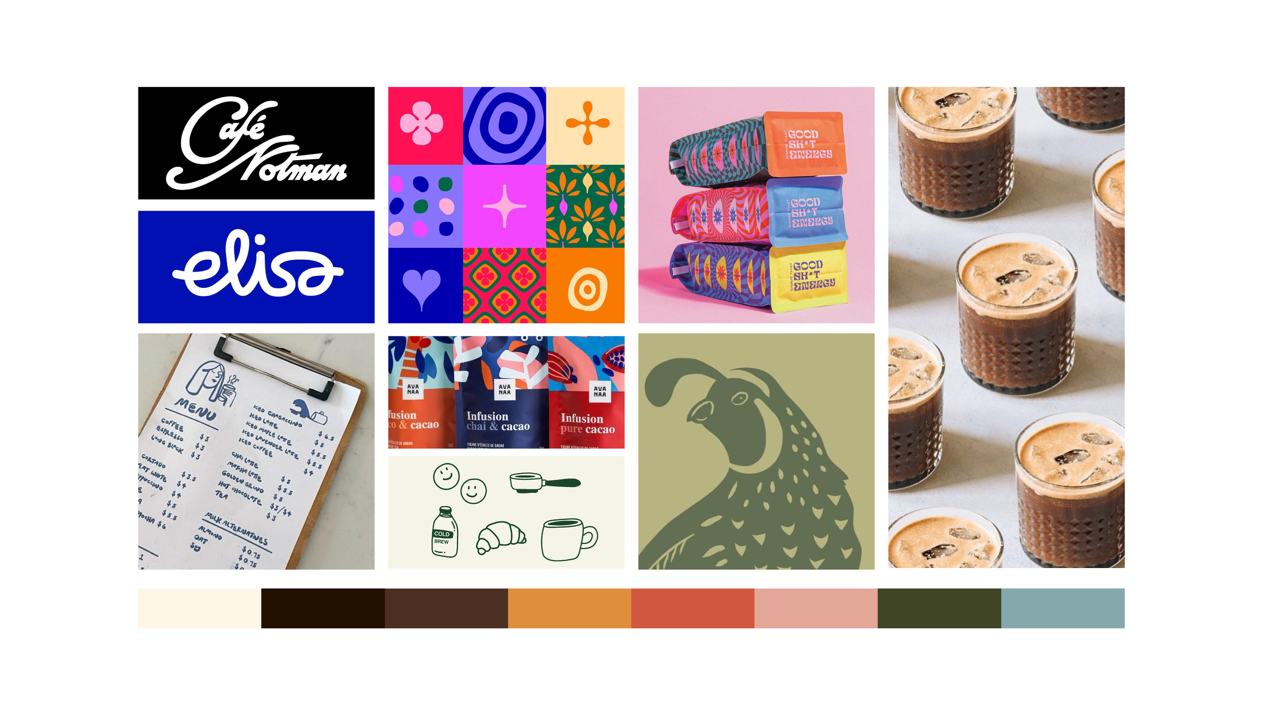
Concept Direction
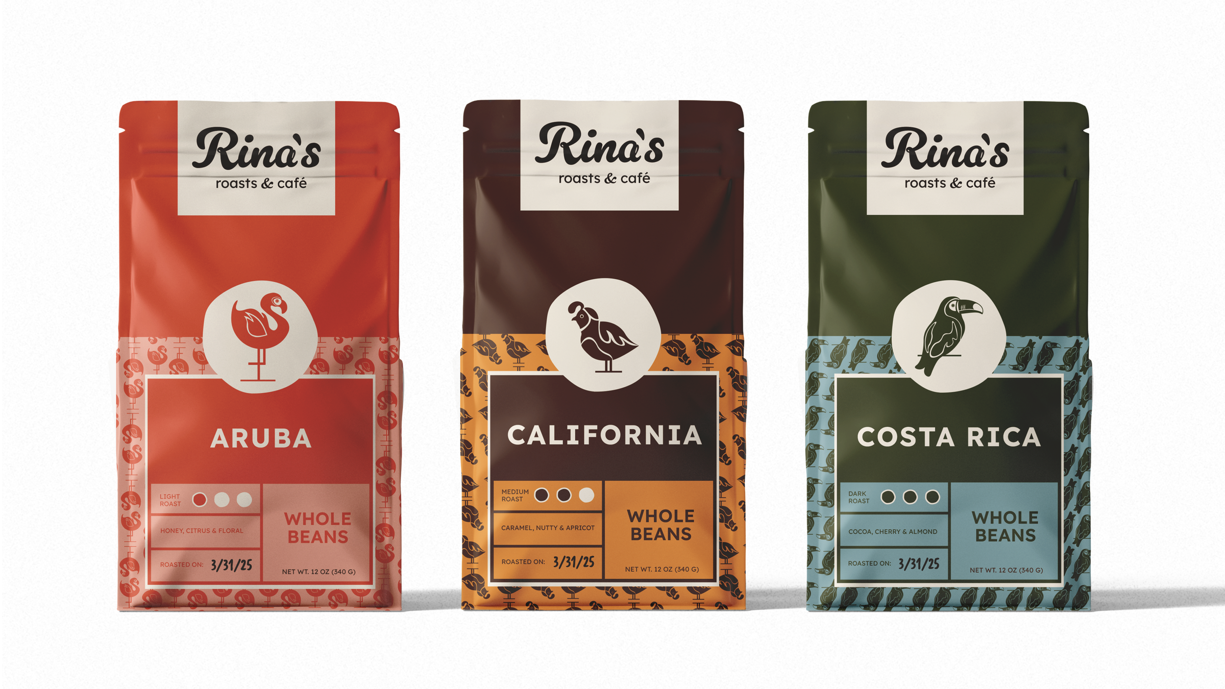
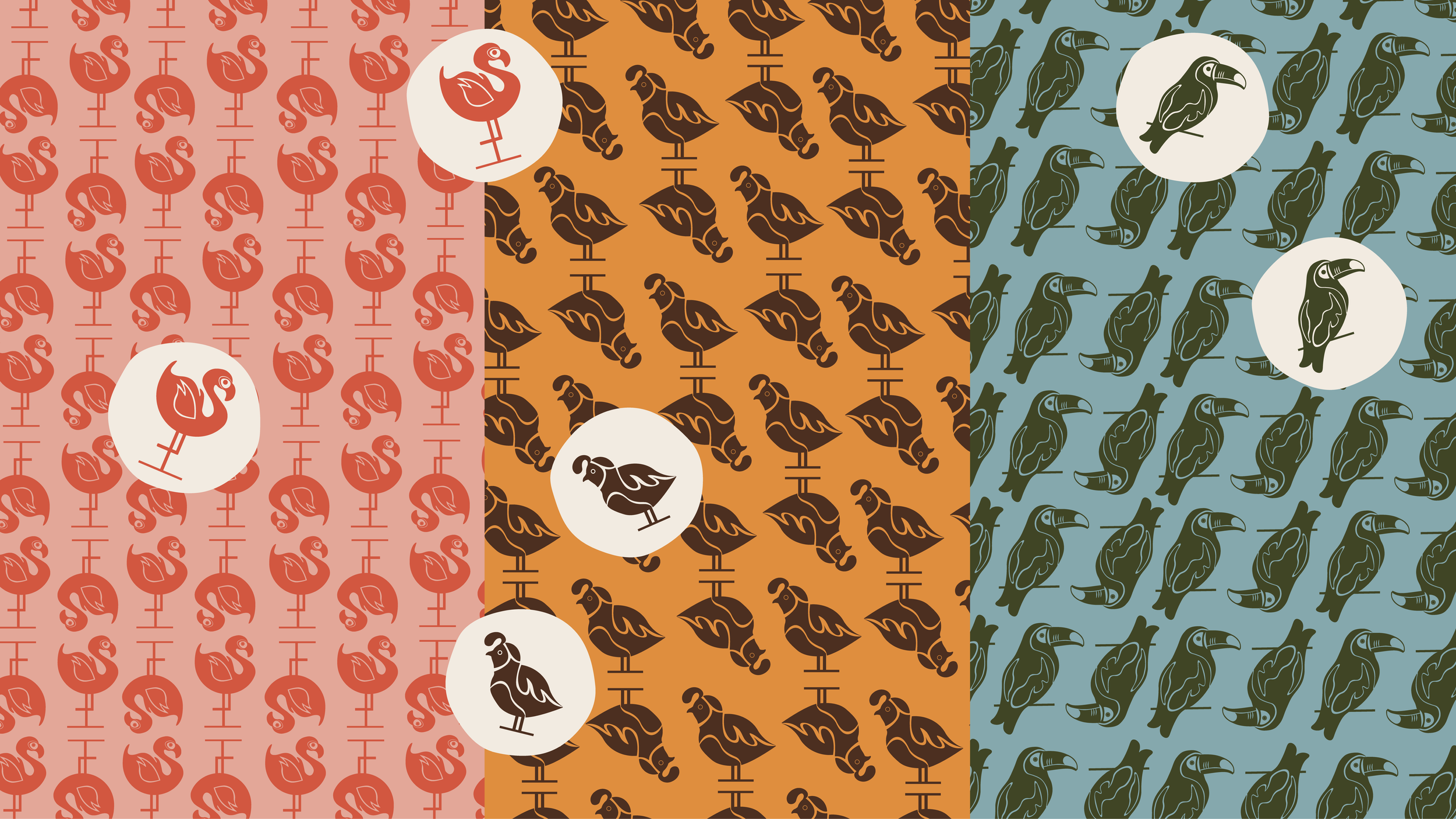
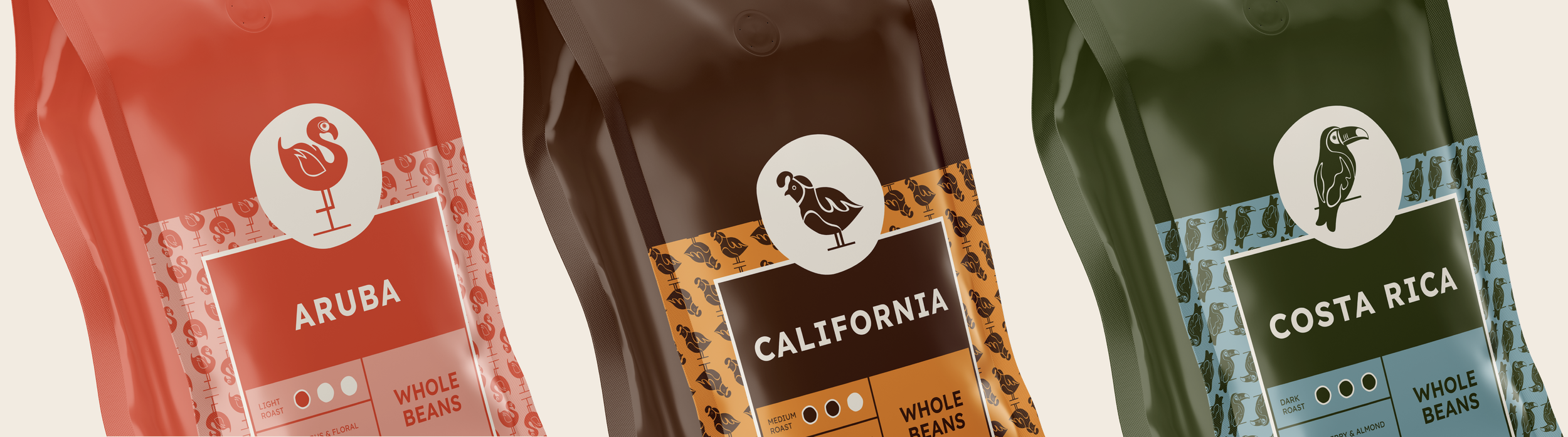
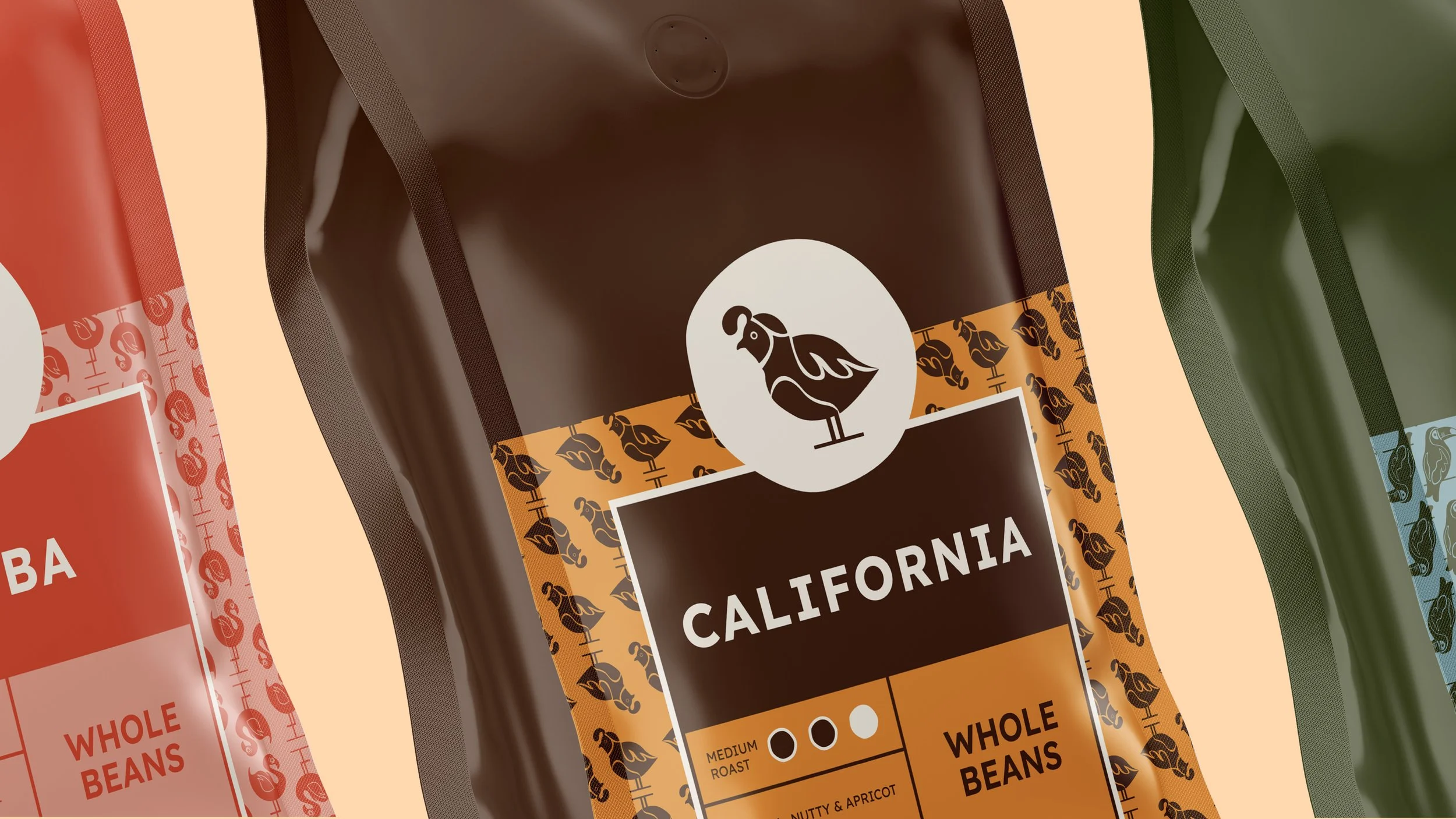
The packaging system brings Rina’s playful bird identity to life through bold color palettes, expressive iconography, and a clear hierarchy that makes each roast easy to navigate. Each origin is paired with its own bird which creates a cohesive series, each with distinct personalities. Repeating patterns reinforce the brand’s charm, while structured grids and strong type provide balance and clarity. The result is packaging that feels lively and approachable.
The Packaging